Every now and then, the music industry decides to revisit some of its more iconic records, and breathe new life into them.
In a similar spirit, I decided to revisit one of my old projects, and see how it would “sound” a few years later: revisit decisions made and solutions applied (if needed), and rebuild parts of it with new tooling and workflows.
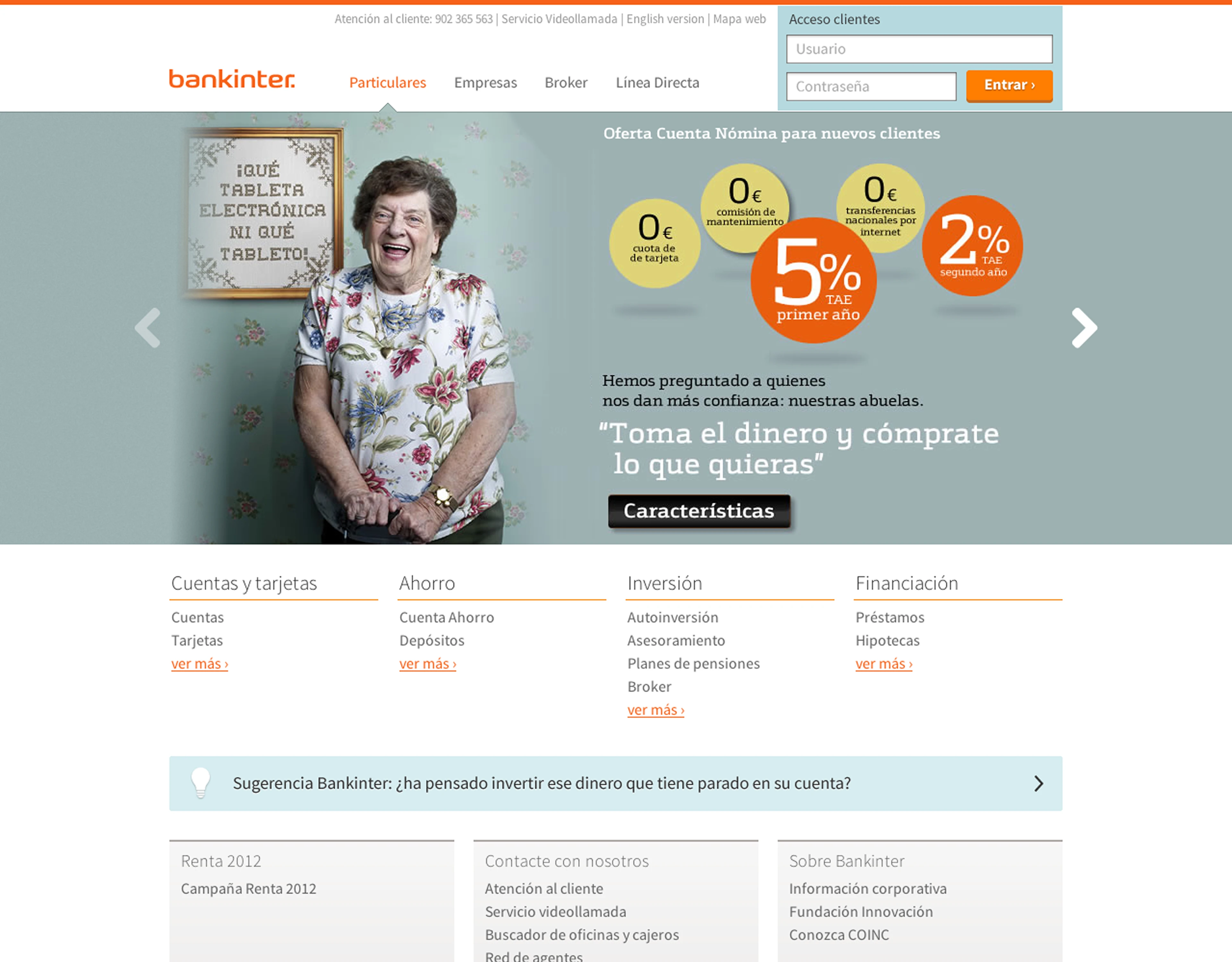
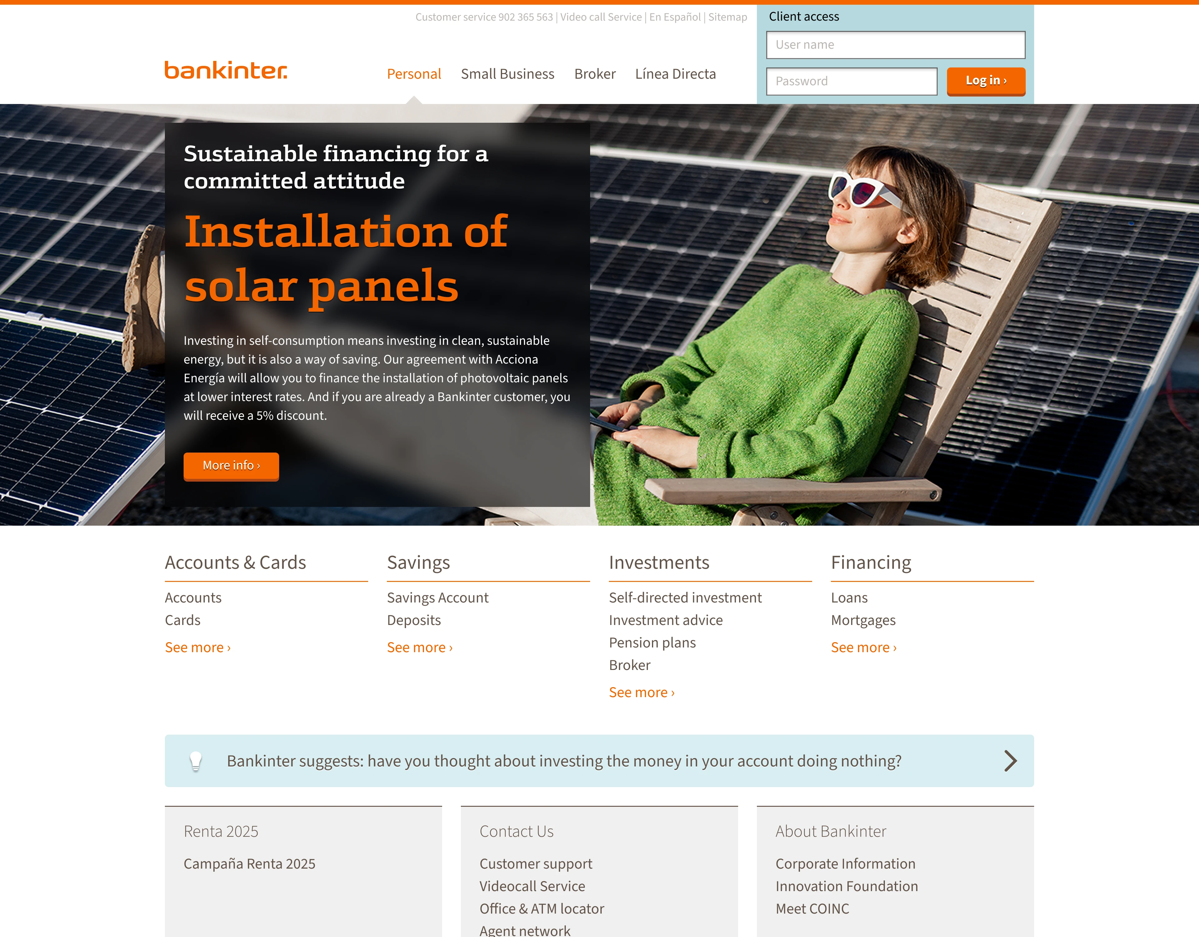
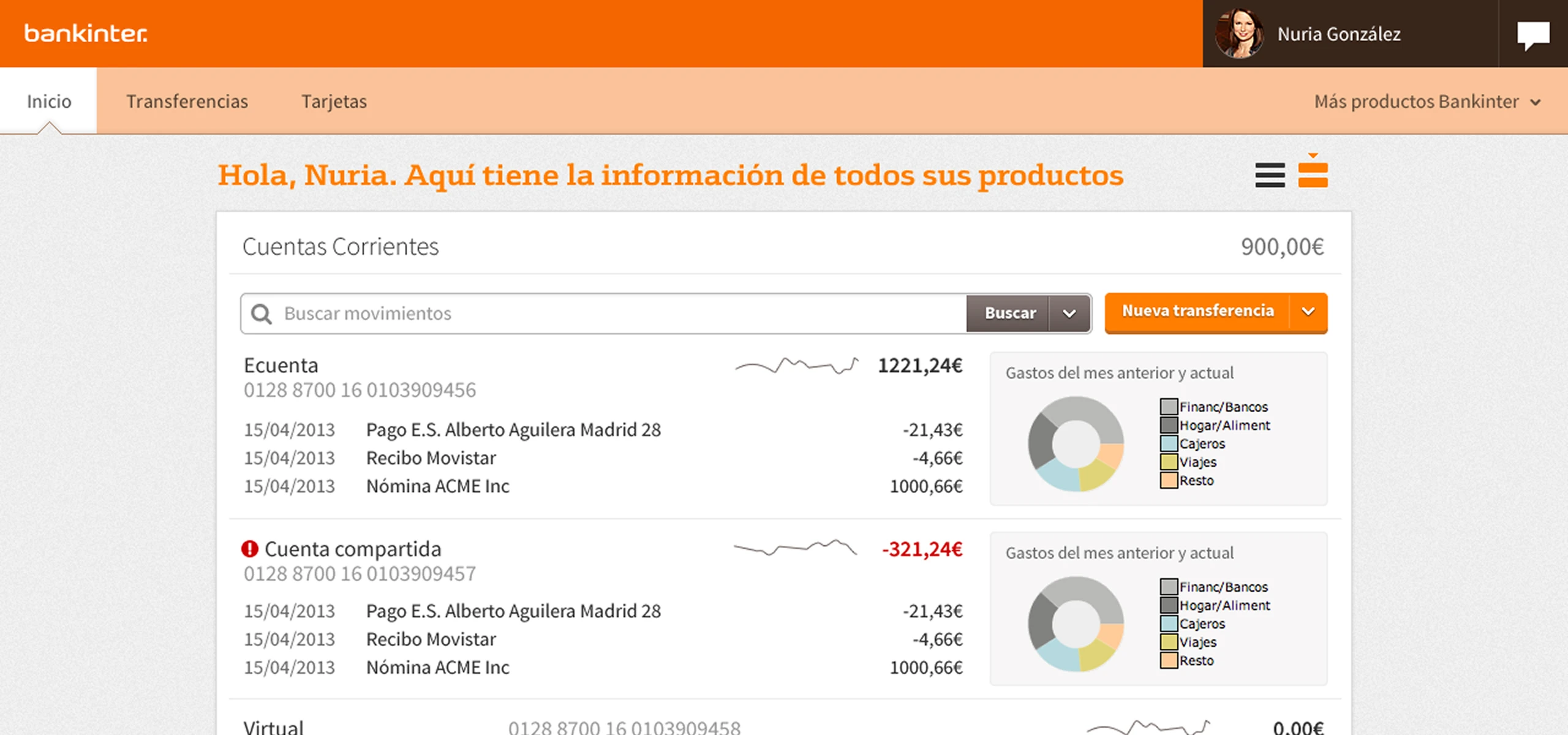
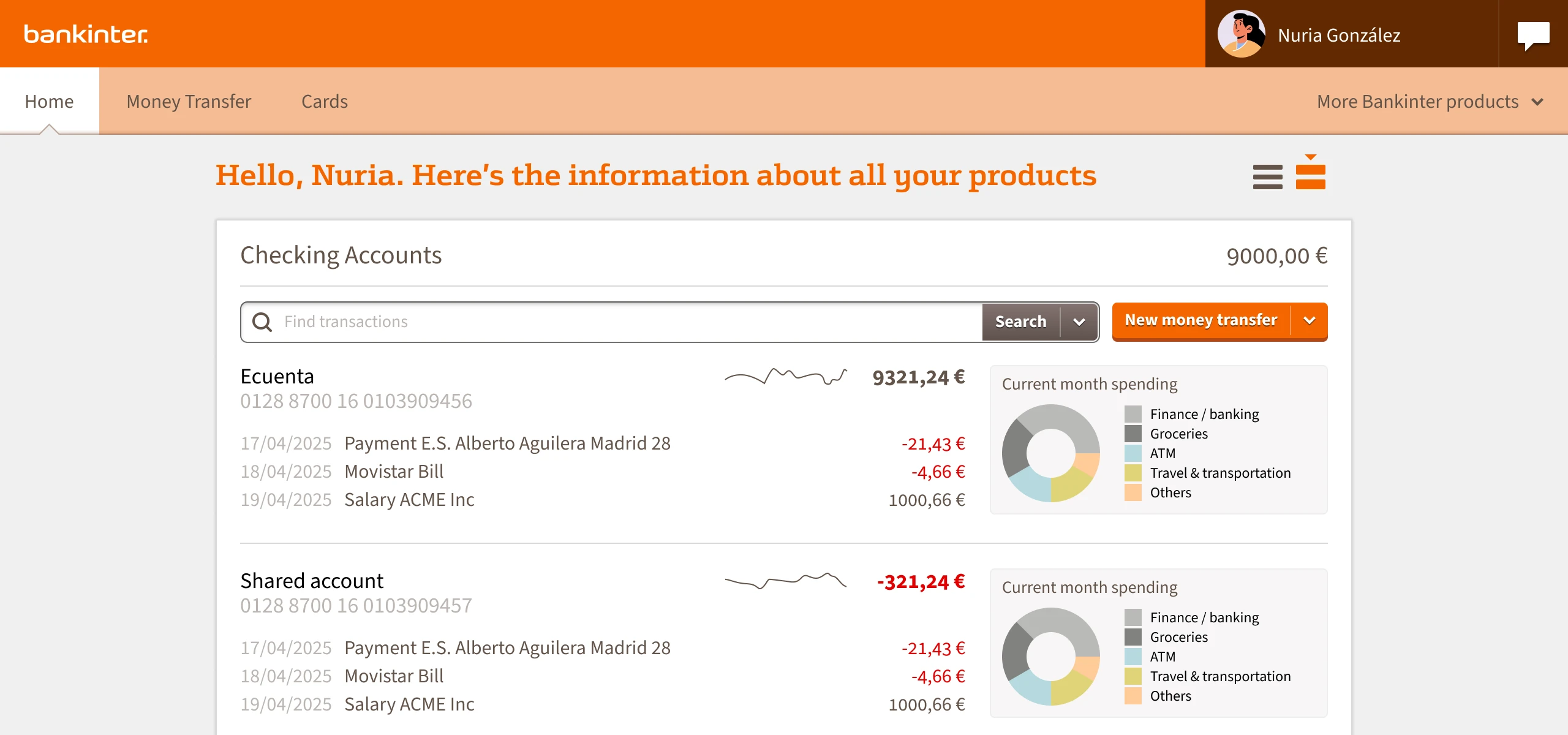
Home page, 2013 vs 2025
I thought it would be an interesting experiment, to evaluate how far we’ve come as a profession (and what, if anything, we’ve missed in the way here).
I was not disappointed.
The original project
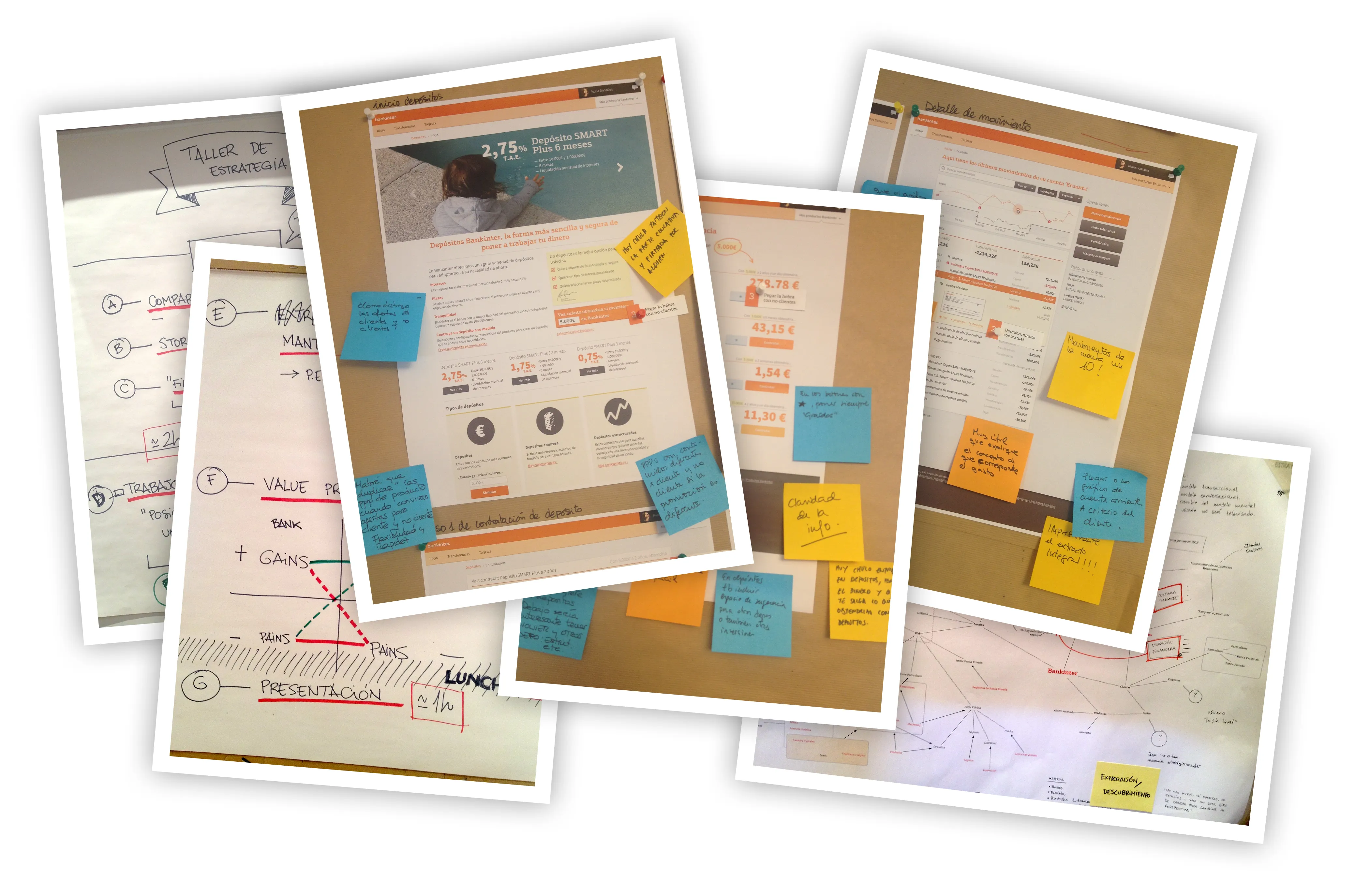
My chosen project is one I’m particularly fond of: the complete redesign of Bankinter, one of the largest banks in Spain (back in the day, at least).
It was a huge project, with a lot of moving parts, and a lot of people involved. I was the lead designer, and I worked with a team of three designers (UX, Business and Service Design), a UX researcher, and a project manager / strategic designer. We worked on the strategy, the design, and part of the implementation of the new design.
It was the last big design project I worked on before joining Sketch, and the things I learnt about systemic design in complex scenarios helped shape many of its features, including the Symbols system in Sketch 3.0.
Also, their branding is orange. That’s always a plus.
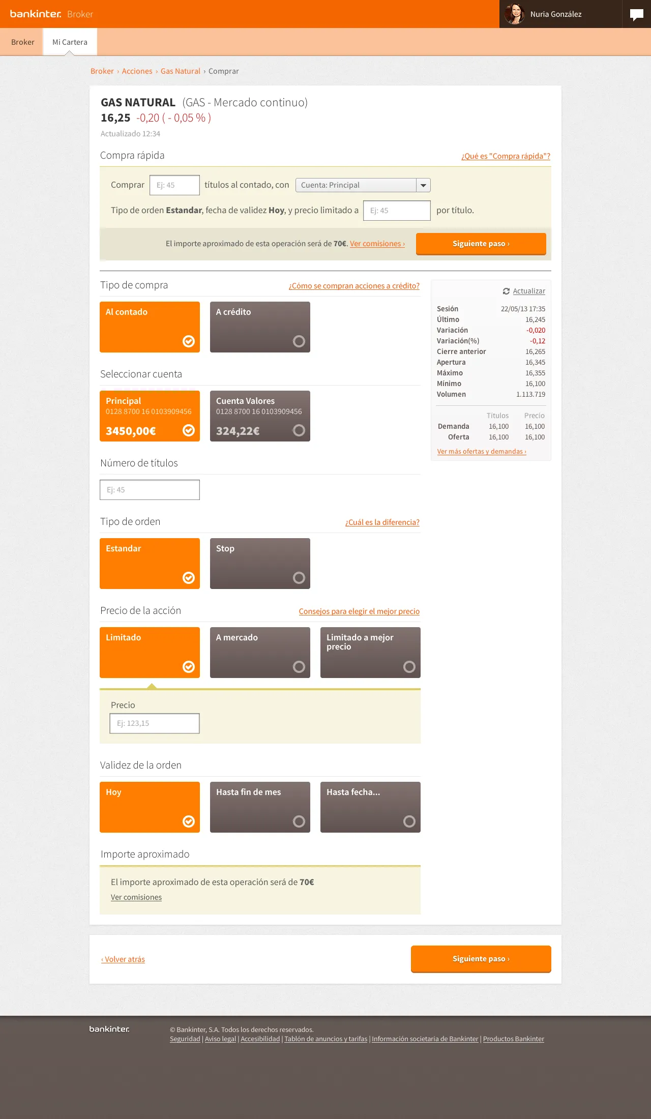
Broker, stock purchase page, 2013
The challenges
The main challenge was dealing with lots of different (and sometimes conflicting) requirements, from the business side to the technical side. Making sure that the design was aligned with the business goals, while also being technically feasible and easy to implement was not always easy.
From a legal perspective, we had to make sure that the design was compliant with all the regulations and laws. The banking sector is heavily regulated in Spain, and some of the things we wanted to do (like investment recommendations based on your financial profile) were not allowed by law. We had to find a way to work around these limitations, while still delivering a great user experience.
On the soft-skills side, it required a great deal of communication with multiple stakeholders, with multiple workshops and presentations to get everyone on board with the new strategy and design.
Finally, we were pushing the boundaries of what was possible with the tools we had at the time. We had to find workarounds for many things, and even create our own tools to make things easier. For example, we created a prototyping tool that allowed us to create interactive prototypes using HTML and CSS, which was a huge help in getting buy-in from the stakeholders.
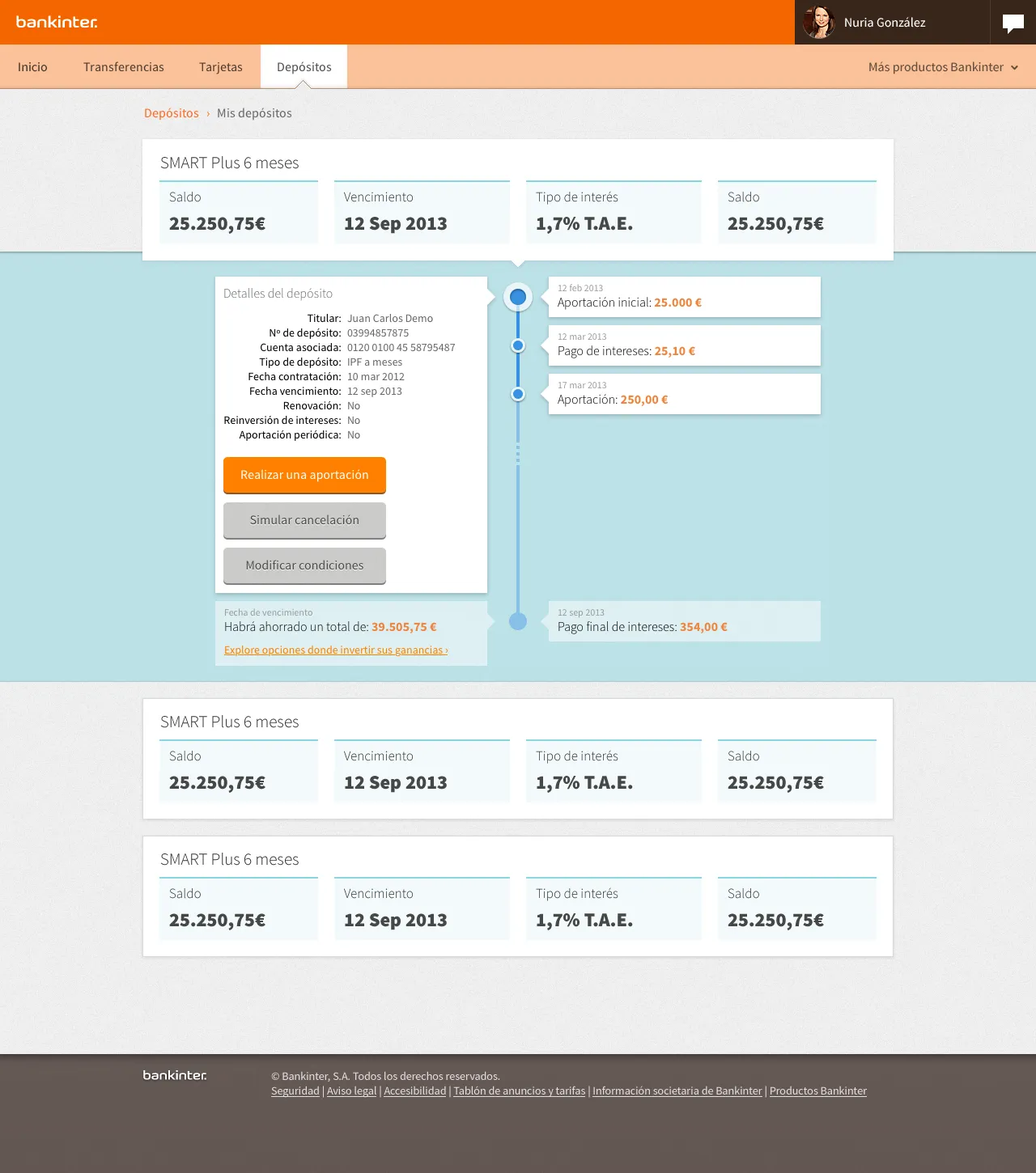
Deposits, details page, 2013
Tooling
Bankinter was the first enterprise project where I started using Sketch alongside our official design tool, Adobe Fireworks. We also added a bit of Adobe Illustrator and Microsoft PowerPoint, and even some HTML for clickable prototypes.
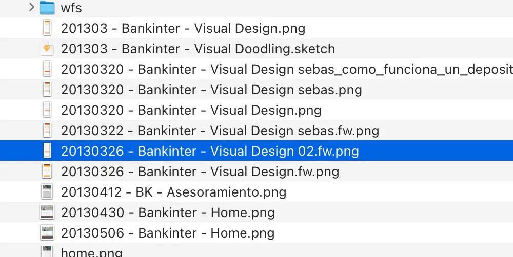
Collaborating with a team back in the day was a nightmare. An infinite game of ping pong via email and shared file servers, with no version control. Hundreds of files named YYYYMMDD-project-name-editor-name.extension, and a consolidation step at the end of every day to merge all the changes into a single file.
A nasty side effect of using Fireworks (and the main motivation behind this remastered project, really) is that all the exports from the project are low resolution bitmaps:
I’m old school, and love the texture of fist-sized pixels and the sharpness of a good pixel-perfect line. But I have to admit these don’t live up to modern standards.
The new project
This is where the remastering comes in: I took the original design and updated it to 2025 standards, using modern tools and techniques. I wanted to keep the spirit and the design decisions as close as possible to the ones we made back in the day.
Design foundations
Big, bold, flat designs are still a thing, and I still love them. I think they work well for the banking sector, where the goal is to make the information as clear and easy to read as possible.
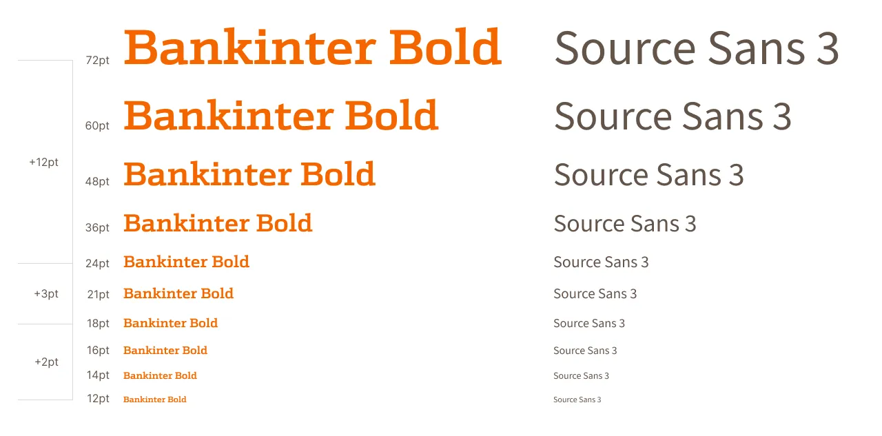
I’m glad to confirm that the basics are the basics for a good reason, and most of the big decisions made back in the day have stood the test of time: the grid, spacing, and font scales still work like the first day.
Visual design
Something we’re missing in 2025 is how easy it was to work with noise textures in fills. Figma has nothing like that (at least natively), and Sketch’s implementation is (still) a bit of a hack. Fireworks’ noise feature was excellent (it was truly random), and I miss it dearly. I removed the noise in most fills, and while it’s not a huge change, it takes away some of the character of the design.
In exchange, we got background blur, which I used in a few places to add some depth to the design (although it’s not the best companion to a very flat design like this one).
The remastering process
I spent some time redrawing a few screens from scratch, translating the text, and polishing the layout and spacing. I even updated the dates on the screens:
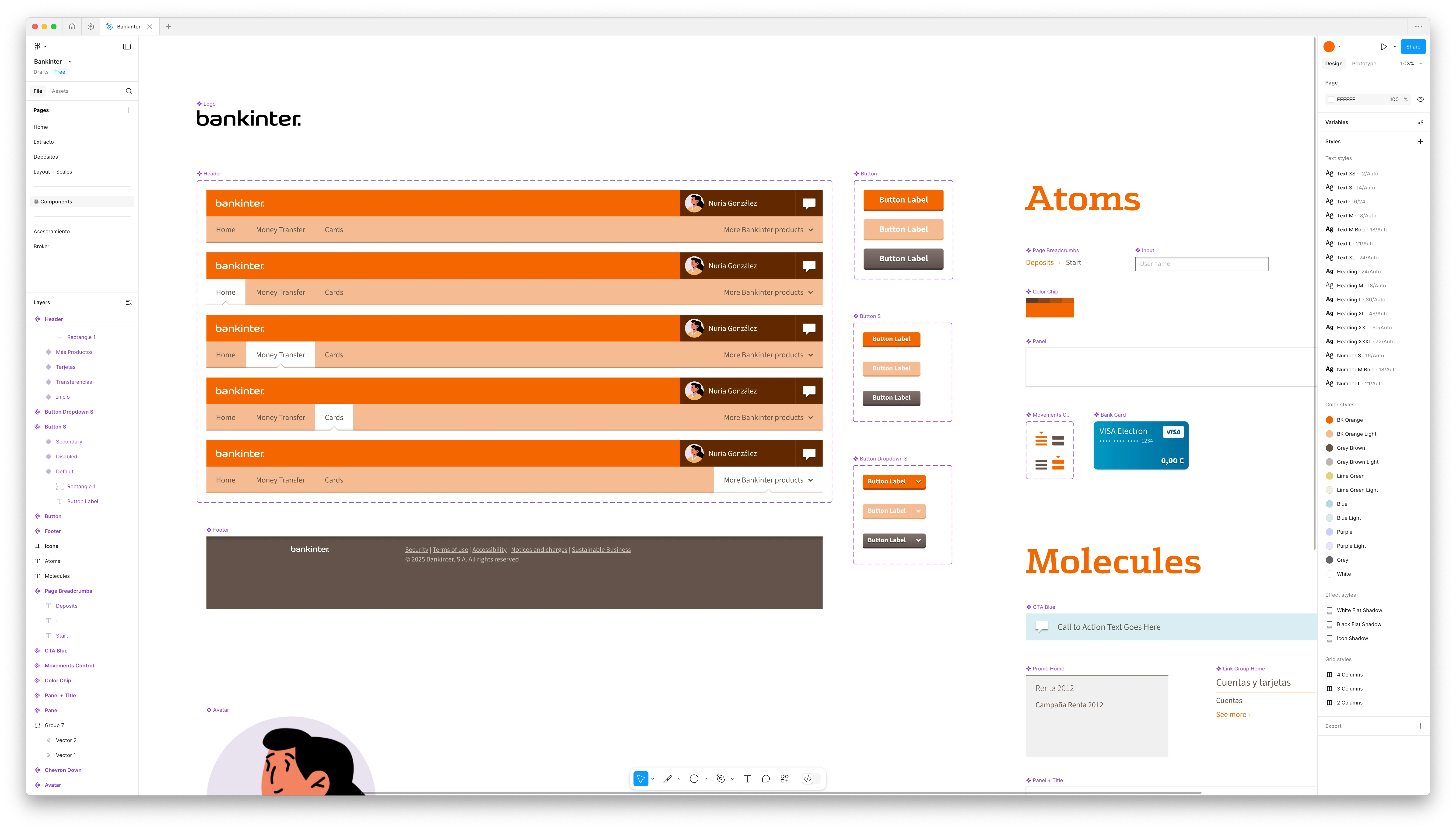
While I was at it, I created styles and components in Figma.
The new project is still a work in progress. The plan is to transition all the original screens to Figma, including the clickable prototypes that we originally created using HTML and CSS.
While I’ve tried to keep the design as close to the original as possible, I am definitely taking advantage of the new tools and techniques available. Symbols in Fireworks were a bit of a hassle to work with, and modern tools make it a lot easier to create and maintain reusable components.
I’m also using Figma’s Autolayout feature to create a more flexible design system, keeping the design as modular as possible. I’m not a huge fan of the feature, but I have to admit it makes some things easier. I still prefer to use it as a last resort, and only when I really need it. As a designer who codes I, think we sometimes forget that Figma is a means to an end, not the end itself. I riff a bit about that in my How I Work page.
Figma file, still a work in progress, 2025
Learnings
We learned the importance of finding sponsors within the organization. We had a few people in the company who were really excited about the project, and they helped us get buy-in from the rest of the team. They were our champions, and they made a huge difference in getting the project off the ground.
We also learned the magical powers of progressive disclosure to stakeholders. We intentionally designed our processes to ensure that all relevant information was shared at the right time, avoiding overwhelming the customer with too much detail too soon. There was no “big reveal” of the design: we started with conversations, then moved to sketches, low fidelity wireframes, and finally, high fidelity mockups. By the time we got to the final design, everyone was on board with the decisions made along the way.
Using an iterative approach to design was a game changer: rather than presenting final designs in phases (as we did in the past), we started by presenting sketches of all the screens which we improved daily. Our goal was to have (crude) clickable prototypes ready from week one. This forced us to think about the design in a more holistic way, and it helped us identify potential issues early on. It also made it easier to get feedback from the team and the client, as they could see how the design was evolving. As a downside, it also meant that we had to invent a new way of working as we went along, and push the boundaries of what was possible with the tools we had at the time.
Fun fact: believe it or not, bankers will check the numbers in your mockups and complain when they don’t add up. In this project, I learnt to design with a calculator by my side 😅
Conclusions
Thankfully, design systems are a thing now. We struggled with this back in the day, and I’m glad to see that the industry is finally catching up with the idea of creating reusable components and styles. Things are still not as explicit as they could be (specially when comparing to code), but working on complex projects is no longer a nightmare.
Collaboration tools have improved dramatically, making it easier to manage projects with multiple designers (or one designer and multiple devices). I can’t imagine going back to the old way of working.
I love that I can now export my work in a vector format. When I need to revisit this project in 2035 for ultra-high resolution screens, I won’t have to redraw everything from scratch 🎉. I’d love to have an open format in all modern design tools, but I can settle for exporting to SVG or PDF.
Autolayout is still not worth it 90% of the time. I find myself actively fighting against it most of the time, and I can’t stop thinking it would be easier to use HTML + SVG / PDF files
For something a bit more personal, this post on my blog has some of my thoughts about design tooling.