Qatium.app UI Redesign
Qatium.app has evolved organically over the years. Small, focused teams have made improvements in multiple parts of the app, resulting in a design that lacks coherence and polish. Here is a quick attempt at addressing some of the more urgent issues.
- ClientQatium, 2025
- ToolsResearch, Visual & UX Design (Figma)
Problem
Qatium’s organization practices a very lean, very agile approach to product development. This means that small teams are constantly working on different parts of the app, and the design evolves organically over time.
While this is great for getting things done quickly, it also means that the design lacks coherence and polish. This is especially true for the Qatium.app web app, which is the main product of the company.
Over the years, little things have crept in. Little customer pains we’ve identified that, while not critical, make the app feel less polished than it could be:
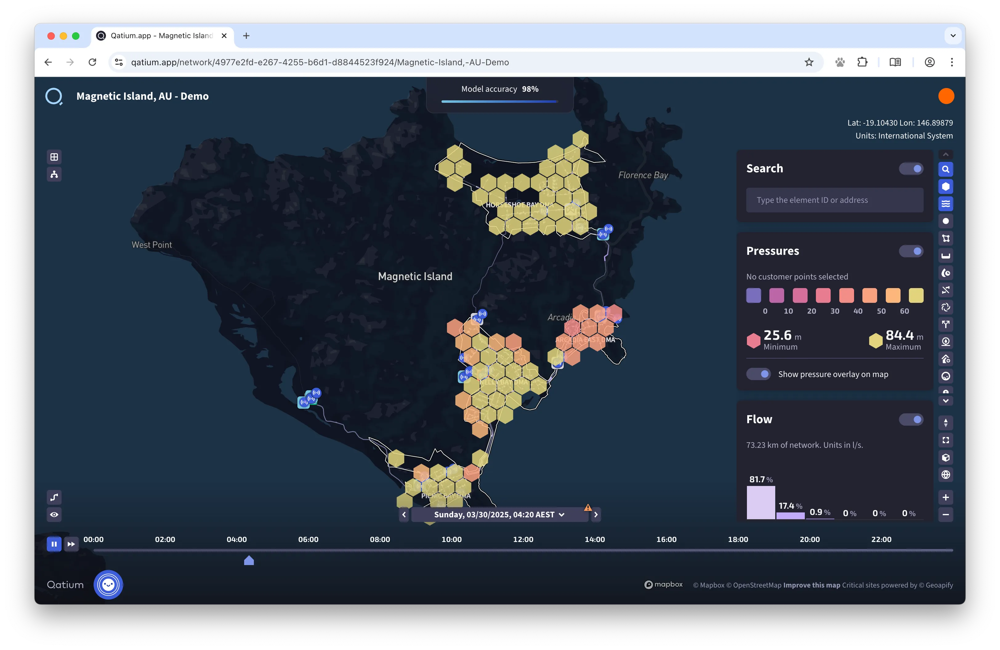
- Alignment: the app lacks a clear grid system, and elements don’t seem to follow any particular order.
- Screen real state is not used efficiently.
- Random empty spaces make the app feel unfinished.
- The bottom timeline is too big and takes too much space.
- The right sidebar has grown to become a monster, and usability is suffering. Icons are too small, they have no labels, and it’s hard to tell which features are currently active.
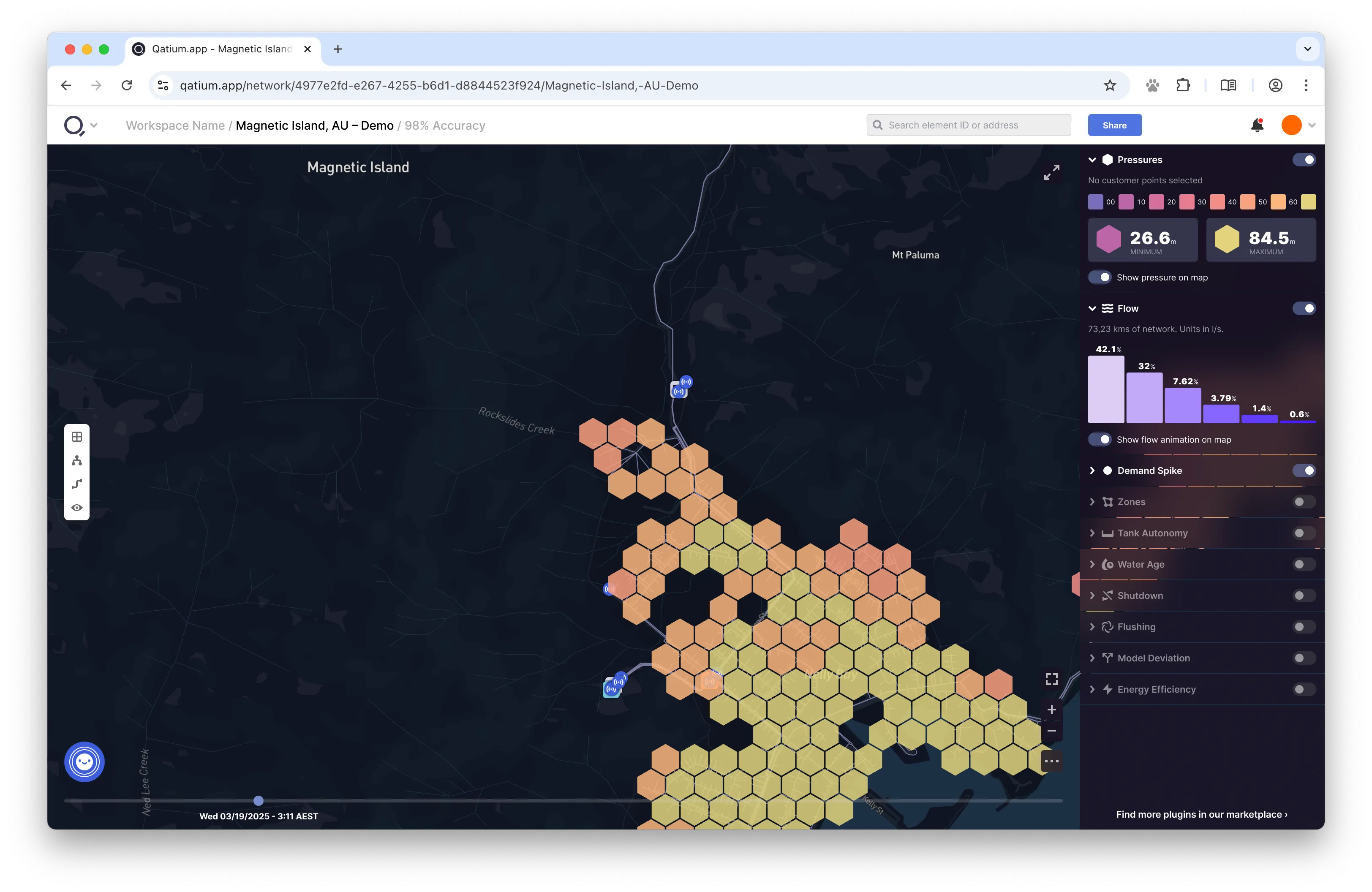
The current state of the app.
Solution
I’ve been thinking about potential solutions to the more urgent issues in the app UI for a while.
During informal research sessions, or while talking to customers, I always take note of the things that could be improved, and how we could solve the issues our customers experience.
So I recently spent some quality time putting these ideas to (virtual) paper, focusing on a few high level changes that our agile process usually overlooks.
I did not focus on things like colors, iconography, or specific app features, since those can be addressed by the teams working on them.
The new design of the app.
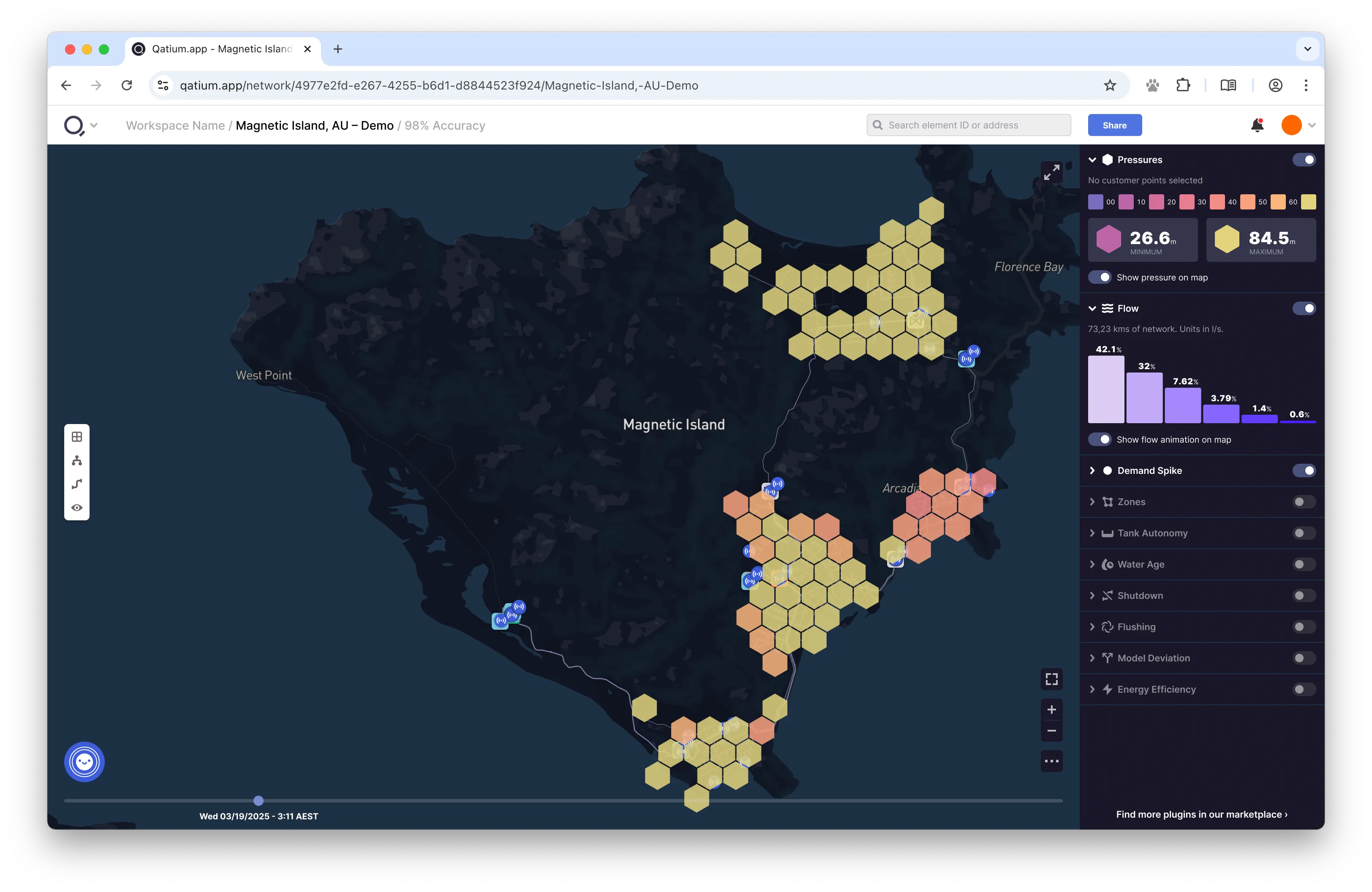
Screen Real State and Alignment
I tightened the spacing between elements, added a grid system to the app, and made sure that all elements are aligned to the grid.
Common elements like the Search bar, the notification bell, and the user menu now reside on a header area that is always visible.
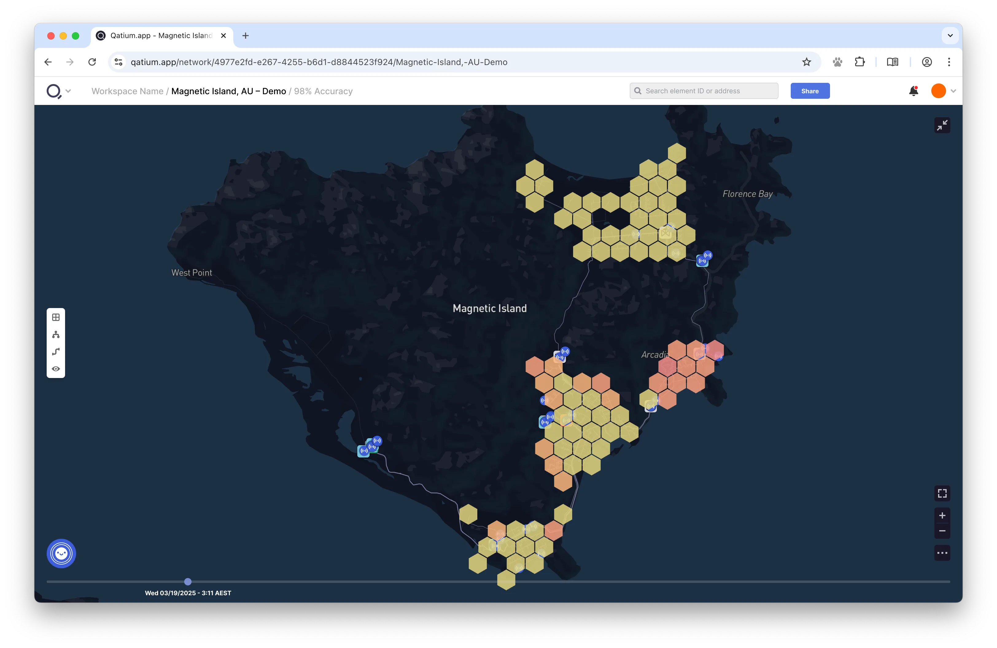
Map Controls
The map controls are now in a familiar place, and the map is now a lot more usable. Extra features are now hidden behind a ‘…’ button.
Users can enter a focus mode that hides all the app chrome and shows only the map. This is especially useful for users on the field who are using the app on a small screen.
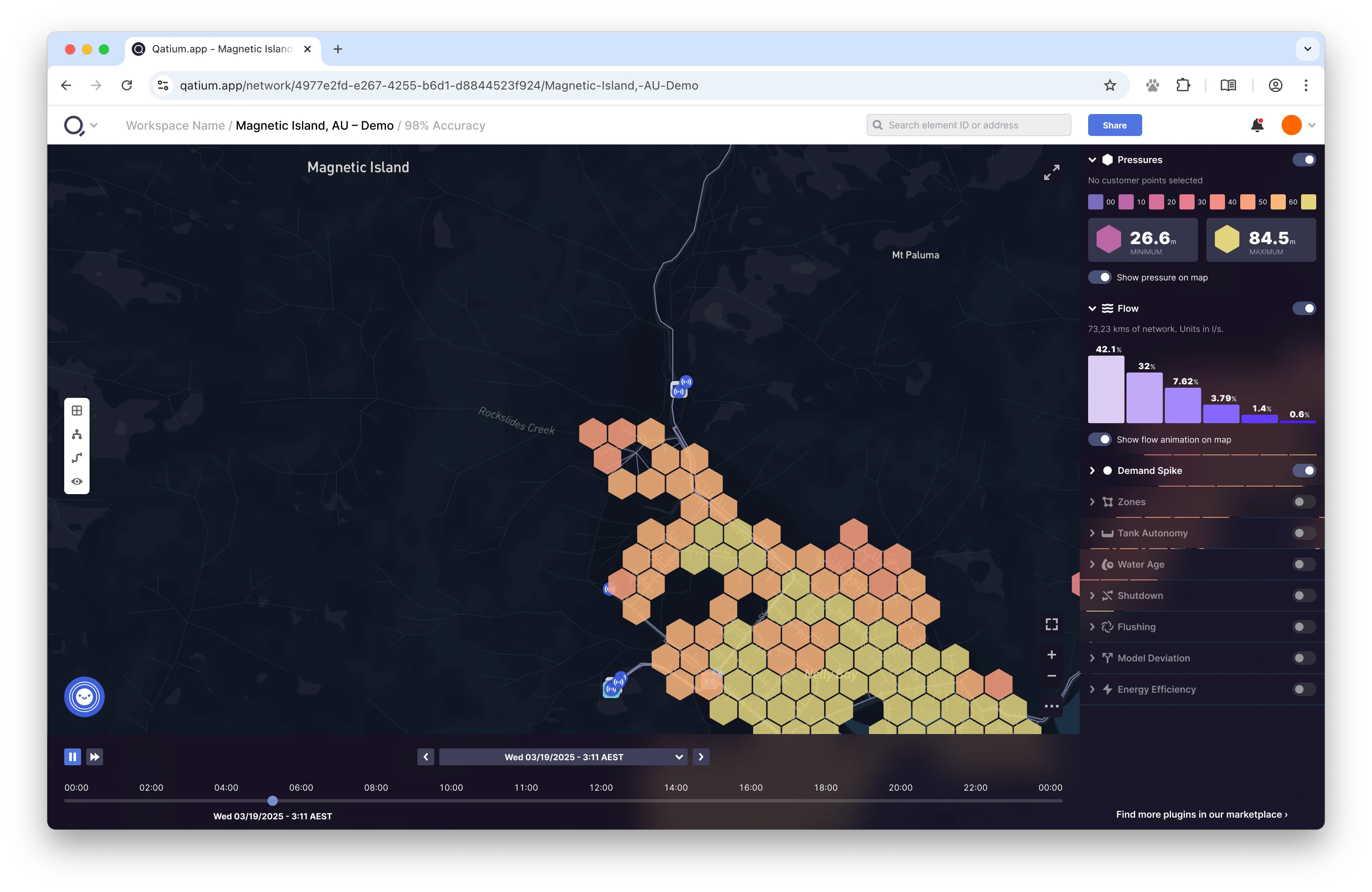
Timeline
I removed all the unnecessary elements from the bottom timeline, to make it smaller. Users can hover over it to see the full timeline, leaving the default state in a much cleaner state.
The right sidebar has been redesigned to be more usable. Icons now have labels. Sidebar elements are collapsible, so you can hide the ones you don’t use often while still being able to tell which ones are active.
The sidebar also has a glass effect to make it feel more modern, and let some of the map content through.
Figma file
I created a Figma file with the new design, which you can find here:
Thank you for your time!
I hope you enjoyed this little experiment. Qatium is a very
fast-paced company, and this design will probably be outdated by the
time you read this. But I hope it helps you understand the kind of work I
do, and the kind of problems I like to solve.