Animated round toggle
I spent a Friday evening building a round toggle component in React, just to prove myself it could be done.
- ClientPersonal project
- ToolsFigma, React, CSS, Motion.dev
Background
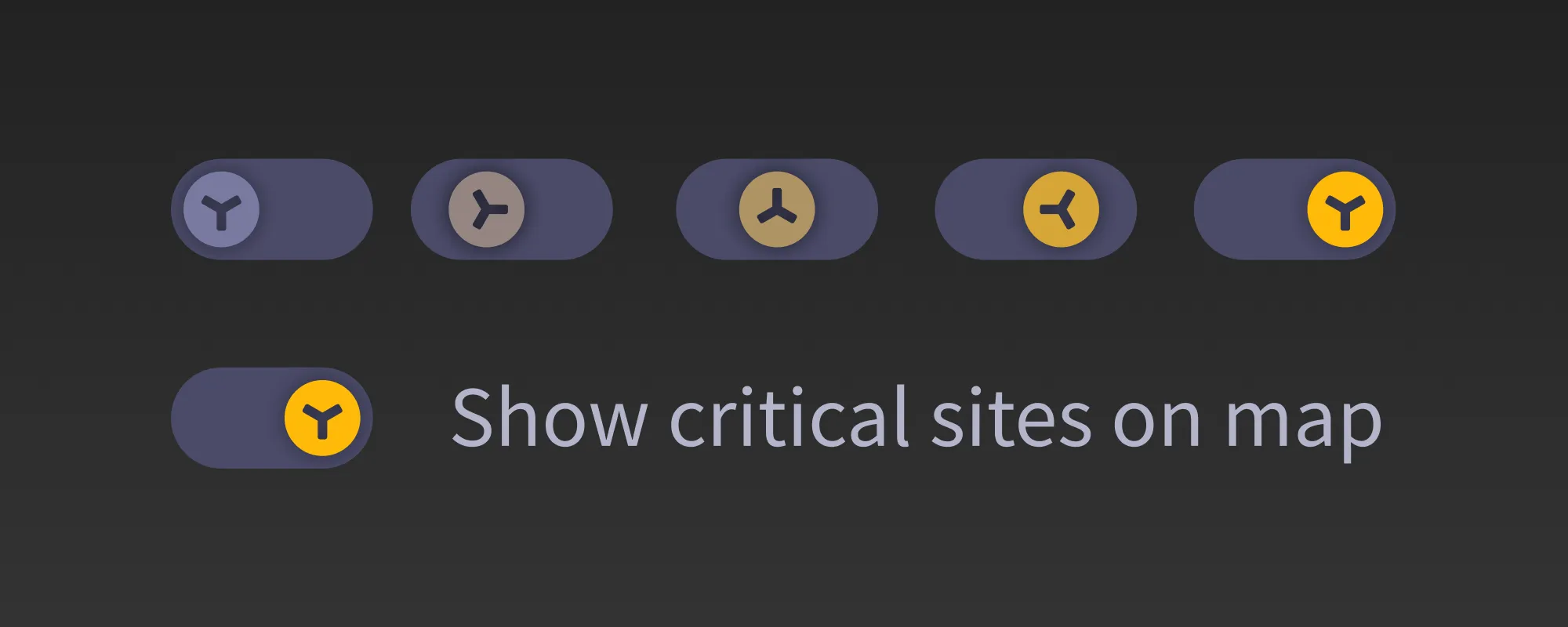
As part of a random task on my daily job, I created an icon that I thought
would look cool as a toggle. I decided to build a round toggle component
in React to see if I could replicate the design in code and make it
interactive.
While I was there, I thought I’d make it infinitely scalable so I could
display it on my portfolio without having to worry about the size.
If you feel like reading a long post about the process, along with some reflections about life, the universe, and design engineering, today is your lucky day because that’s exactly what I wrote about in my blog.
However, I understand you’re busy, so here’s a quick summary:
Development
I used React to build the component, pure CSS for the styling, useState to keep track of the toggle state and motion.dev for the animations.
Animation
Turns out it’s not easy to make a handle roll convincingly. I tried a few different approaches, mostly involving the number of rotations and the speed of the animation. Make the animation too fast and you can’t really perceive the rotation. Make it too slow, and you’ll get bored. Eventually, I settled on a 240° rotation and a simple tween animation (with an extra touch of anticipation).
Documentation
I’m going to skip the “picture of the thing vs the thing” debate here, and just mention that this is the kind of thing that’s hard to document in a way that doesn’t get stale.
Luckily I can code, because there’s nothing like actual code to explain how the animation works:
const rotations = 4;
const speed = 0.6;
const handleRotation = isOn ? 60 * rotations : 0;
const transition = {
  duration: speed,
  type: "tween",
  ease: "anticipate"
};
Further reading